Problem Statement
Indistinct messaging and inconsistent branding. Low traffic, low conversions, and slow site speeds. The previous website was built on Wordpress, using Elementor Pro (a WordPress builder).
Scope and Goals
Streamline messaging and buyer journey based on learned user personas and a keyword strategy with the goal to increase traffic, increase conversions, and ranking higher on Google.
Establish brand goals and institute a design system.
Investigate and address reasons for slow speed such as unoptimized images, complex code structure, lack of caching, and a plugin audit.
The Cross-Functional Team

Project Manager
KIEV, UKRAINE

Content Strategist
OTTAWA, CANADA

UX Designer
KIEV, UKRAINE

Technical Writer
SF, CALIFORNIA

Lead/UI Designer
OTTAWA, CANADA

SEO Strategist
TORONTO, CANADA

Lead Developer
MUMBAI,INDIA

Quality Assurance
ATLANTA, USA
Process

Phase One
Target Audience and Competitors
C-level suites at enterprise companies.
We identified customer pain points by interviewing all customer-facing associates in the company: CEO, CFO, Sales, Product, Customers Success.
We studied competitor sites (Citrix, VMware, Azure) and competitor reviews.

Phase Two
User Journeys, Wireframes, Sitemaps
We explored the buyer journeys per persona and per use case to refine the site map.
Here, we also recognized the need to migrate the (Hubspot) blog and all external landing pages back within the website. This would also streamline our URLS and improve our SEO.

Phase Three
Imagery
Images should reflect the mood of the user and the business. This person is focused, working, and often found outside of an office. Here, this woman is traveling while working.
To correlate all the photos, we desaturated the image while always highlighting the device with one of our brand colours.

Phase Four
Global UI Elements
We decided to keep the existing purple CTA but bumped up the hue to make it pop more against dark and white backgrounds, as well as pass WCAG and AODO compliance.
We added three more bright colours to the palette for differentiating the multiple solutions that Tehama's Hybrid Work Platform offers.

Phase Five
Pixel Perfect Mock Ups for Dev Handoff
Mock up all pages in 4 different sizes for responsiveness. Label all components, colours, text styles, hover states, loading states, error messages, and responsive behaviours.
Click-through prototypes were prepared for some user flows for testing.

Phase Six
Review, Test, Iterate
We QA'd for technical bugs, and we tested the site and its contents among our executives, board members, Gartner advisors, and select customers.
We also used the Wynter.com app to further vet our messaging to a broader (anonymous) community of C-suites.
Outcomes
Inbound Conversion YOY
Traffic Increase YOY
Technical SEO Health Score
88%
92%
90%
360 Marketing Collateral
-
Video Direction and Production
-
Animated Gifs for Social Media
-
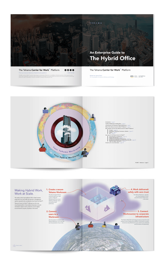
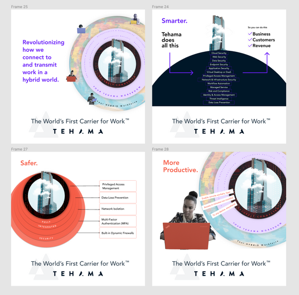
Ebooks, digital and printed
-
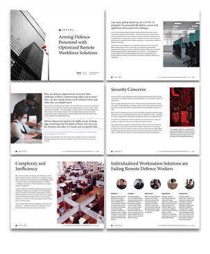
Datasheets
-
Pitch Decks
-
Event Collateral
-
Paid Search Display Ads


Continued Improvements
• Launched A/B testing and heatmap testing to see how effective all the text in the header was performing. Test results proved that people were not spending enough time to read it, that they were eager to start scrolling to learn more.
• Added FAQs to highest-ranking pages based on SEO queries, to further optimize organic search.
• Successfully migrated Hubspot-hosted Tehama Blog to WordPress which includes a search engine.
• Launched a 7-day Premium Free Trial.
• Launched a global "Advantage Partner" program with its own brand identity that compliments Tehama's brand. https://tehama.io/partners/
